Designing Stakeholder-Friendly Dashboards for Game Publishers
Turn Game Data Into Clear, Actionable Insights—For Every Role
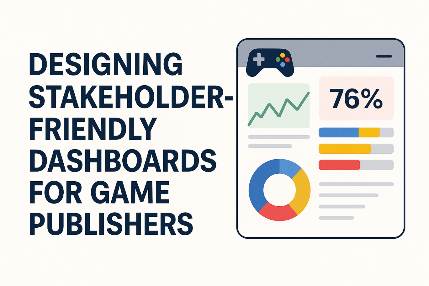
In live game operations, data is abundant—but actionable insight is rare. Publishers and studios often struggle to translate complex telemetry into clear, useful information for decision-makers. From executives to engineers, each team needs different views of the truth. The key? Build dashboards that speak each stakeholder’s language. This article explains how to design dashboards that drive clarity, accelerate decisions, and support better outcomes across your game operations.
Why Most Dashboards Miss the Mark
A dashboard should do more than display metrics—it should guide decisions. Yet many fall short. Here’s why:
- Too Complex: They cram in every metric, losing focus and overwhelming the viewer.
- No Context: Raw numbers appear without explanations, trends, or implications.
- Generic Layouts: All teams get the same view—even when their goals differ.
- Visual Clutter: Important KPIs get buried under irrelevant data.
To create real value, dashboards must be tailored to the audience and built around action—not just reporting.
Five Principles for Effective Dashboard Design
1. Tailor Dashboards by Role
Each team has unique priorities:
- Executives need business-level metrics: revenue, CCU, churn trends, and SLA adherence.
- Producers & Live Ops want live game health: matchmaking delays, player friction, and economy stability.
- Engineers require granular data: server uptime, API latency, error rates, and deployment success.
Tip: Avoid mixing business and technical data in a single view. Instead, create role-specific dashboards optimized for each team’s decisions.
2. Emphasize Clarity, Not Quantity
More data doesn’t mean better decisions. Focus on:
- Key KPIs only—those that drive real-time decisions.
- Clear visual hierarchy: bold, prominent indicators for urgent or critical metrics.
- Color-coded status cues (e.g., green/yellow/red) for rapid understanding.
3. Show Trends, Not Just Snapshots
Static metrics lack context. Stakeholders need to see:
- Time-based insights: how metrics evolve over time.
- Comparisons: benchmarks vs. targets, current vs. previous week/month.
- Example: Don’t just show “current CCU”—plot CCU over the past 24 hours, with week-over-week comparisons.
4. Add Context and Actionable Recommendations
Dashboards become strategic when they go beyond “what” to include:
- Why it matters: Highlight anomalies and deviations from target.
- What to do next: Include recommendations based on thresholds.
- Example: “Server latency is 220ms—above the 150ms target. Consider scaling backend nodes.”
5. Design for Usability Across Devices
- Make dashboards accessible from mobile devices for on-the-go visibility.
- Remove technical jargon in executive views—use business-friendly language.
- Enable interactive filtering so users can explore what matters to them.
Dashboard Types That Drive Results
| Audience | Dashboard Focus | Key Metric Examples |
|---|---|---|
| Executives | Business Performance | Revenue, Churn, Peak CCU, SLA Compliance |
| Producers | Live Ops Health | Matchmaking Time, In-Game Errors, Economy |
| Engineers | Technical Monitoring | Server Load, API Latency, Error Rates |
Conclusion: Dashboards as a Strategic Advantage
Well-designed dashboards don’t just report—they empower. By aligning dashboards with each stakeholder’s goals, simplifying visuals, and embedding real-time context, you create tools that accelerate decision-making and drive operational excellence.
Want dashboards that truly support your teams?
Zumidian helps game publishers build custom, role-based dashboards that surface what matters—when it matters. Contact us to learn more about our operational analytics solutions.